Data Driven Money

Live. Work. Retire. Smart.

Calculate Compound Interest with Contributions in Python

How to use Python to Calculate Compounding Interest with Contributions

Table of Contents

In a previous article I showed how to use Python to calculate and plot out Compound Interest based on an initial lump sum. Here I will take it a step further. In this article I will show you how to use Python how to calculate Compound Interest with Reoccurring Monthly Contributions.
 
In addition to computing compound interest with monthly contributions, I will also show how to plot out multiple scenarios at once. Using a visual device often helps further describe possible effects of saving more or less over a long period of time.
 

Getting Set Up

To make things simple I wll be using Google CoLab for my Python Environment. It’s free and can be accessed with a web browser (Chrome only). Using CoLab will make most of Python’s most popular packages available right at the outset so there won’t be much in the way of having to install anything.
 
In the below code block you will see the code necessary to import the appropriate Python packages and subsequently plot our calculations. The final line will format our float variables in a manner that keeps our values looking like dollars and cents.
				
					# import the libraries to eventually compute
# compound interest with monthly contributions
# and then to plot out the results

# need these for data manipulation
import pandas as pd
import numpy as np

# need these for plotting our results
from matplotlib import pyplot as plt
import seaborn as sns

# Format 'money' columns to two decimal places in pandas
pd.options.display.float_format = '{:6.2f}'.format


Compound Interest Formula and Input Variables

Next, we will need to define our input variables. Below is the traditional formula for compound interest:

Results = P * (1 + r/n) ^(n * t)

P is our starting principal, r is our annualize rate of return, n is the number of months in a year (12), and t is the number of years.

The traditional formula is missing one thing necessary to calculate compound interest with contributions… the contributions! To make this change we have to add another term to our formula.

Results = P(1+r/n)^nt + M((1 +r/n)^nt -1)/(r/n)

The only additional variable in this new formula is M. M is the monthly contribution amount. In the next code block I have initialized each one of these variables. Feel free to change these to fit what you are trying to model.

				
					# Prepare our input variables in order to compute compound interest
# with monthly contributions

###############################################################
###############################################################
## Change the Below Variables for your investment scenario

P = 10000 # The Starting Principal
r = 0.10 # The Annual Interest Rate to Compound On 10%
n = 12 # The Number of Months in a Year
t = 40 # The Number of Years to Compound
M = 100 # Monthly Contribution Amount

###############################################################
###############################################################


Compounding Interest with Monthly Contributions

Let’s start with a simple calculation. In the next code block I have created a DataFrame called ‘results‘ that will be used to store the Year and the Account Amount. A for loop is called to iteratively calculate the values for each year. Finally, at the end, I print out both the first year and the last year’s results.

				
					# Calculate the End of Year Balance for Each Year

# Prepare a DataFrame to store the Year and Final Balance
results = pd.DataFrame(columns = ['Year', 'Amount'])

# Iterate through each year to find the ending balance
# then append it to the results DataFrame
for i in range(1,t+1):  
  Year = i
  Amount = P*np.power((1 + r / n), n * i)+(M)*(np.power((1+ r / n ), n * i)-1)/(r / n)
  results =  results.append({'Year': Year, 'Amount': Amount}, ignore_index = True)

# Our Year's data type needs to be an integer not a float
results['Year'] = results['Year'].astype('int')

# print out the results
print(results.head(1))
print(results.tail(1))


If you run the code block above, you will see that if we calculate the compounding interest on a principal of $10,000 at a rate of 10% with $100 in reoccurring monthly contributions we arrive at a final balance of $1,169,414.59. That’s not too shabby!

When I run the same calculation except with monthly contributions set to $500, the final amount ball0ons to $3,699,046.42. By using the code available already, it is easy to quickly change the variables to test various scenarios.

Plotting our Initial Data

Now let’s see how the data we calculated looks as a bar chart. Theoretically, with compounding interest we should see a curve that gets steeper as it moves to the right… we should be able to see if that pans out.

To create our plots, we will be using matplotlib with seaborn on top. These packages were already imported above. I added some color and changed the default theme to give it some flare but the charts themselves are highly customizable.

				
					# Now its time to plot out what we have calculated

sns.set(rc={'figure.figsize':(11,8)}) # Change the size of the plot
sns.set_style('whitegrid') # Change the default background
sns.set_palette('Greens') # Change the color of the bars themeselves

# Plot it Out
sns.barplot(data = results, x ='Year', y = 'Amount').set_title('Compound Interest Plot (10% Return, \$10,000 Principal, \$100 Contribution)')


Compound Interest with $100 Monthly Contributions at 10% Interest

Comparing Interest Rates

Everyone has heard the statement, “Past Performance Does Not Predict Future Results.” With this in mind, we need to be open to multiple futures. In other words, we need to understand how various rates of return may impact the compounding of our principal and reoccurring contributions.

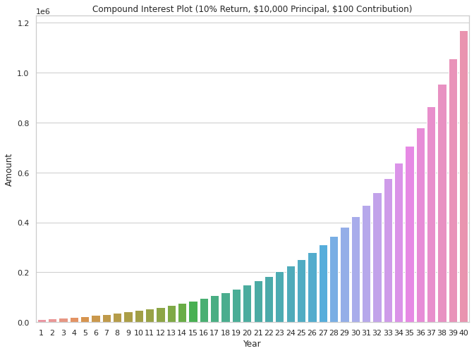
To do this I will just throw all the code we initially used to compute our final amount into another for loop. This loop will iterate through each of the specified interest rates defined in the variable interest_rates.

At the end of the for loop I will go ahead and plot out our data but in order to visualize it all on one chart we will need to do it a bit differently. Instead of using a bar plot, I will use a line plot. This will allow us to see each set of data as a line across time. I will set the ‘hue‘ of each line to vary based on the interest rate.

				
					# Calculate the End of Year Balance for Each Year

# Prepare a DataFrame to store the Year and Final Balance.
# For this next calculation we add the 'Interest' field so 
# we can keep track which data is which.
results = pd.DataFrame(columns = ['Year','Interest', 'Amount'])

# identify which interest rates to iterate through
interest_rates = [.06, .07,.08, .09, .10, .11, .12]

# Iterate through each year to find the ending balance
# then append it to the results DataFrame
for j in range(len(interest_rates)):
  for i in range(1,t+1):  
    Year = i
    Amount = P*np.power((1 + interest_rates[j] / n), n * i)+(M)*(np.power((1+ interest_rates[j] / n ), n * i)-1)/(interest_rates[j] / n)
    results =  results.append({'Interest': interest_rates[j], 'Year': Year, 'Amount': Amount}, ignore_index = True)

# Our Year's data type needs to be an integer not a float
results['Year'] = results['Year'].astype('int')

# Now Let's go ahead and plot it out
sns.set(rc={'figure.figsize':(11,8)}) # Change the size of the plot
sns.set_style('whitegrid') # Change the default background
plt.ticklabel_format(style='plain', axis = 'y') # prevent sci notation on y-axis

# now for the actual plot
sns.lineplot(data = results, x ='Year', y = 'Amount',
              hue = 'Interest', palette = 'Greens').set_title('Compound Interest Plot (Varying Returns, \$10,000 Principal, \$100 Monthly Contribution)')


Compound Interest with $100 Monthly Contributions Varying Levels of Interest

Now we are getting somewhere! As you can see from the above chart, it is possible to get a pretty firm grasp of how an expected return over a period of time can drastically change the performance of the compounded principal. An interest rate of 12% looks to be about 8 times more effective at building wealth.

Using this type of chart is a great way to conceptualize your expected progress, or if you are a financial advisor, to show your clients how different investment options may perform.

Showing the Effect of Varying Contributions

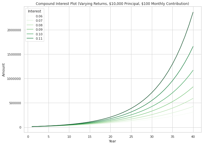
I have shown how to plot out the performance of various interest rates… now let’s see how varying contributions may affect our performance. I will set up the code in a similar way as before with nested for loops, except this time I will be iterating through another variable called ‘contributions‘.

Changing the list of values in ‘contributions,’ will allow you to change when contributions are computed. As before, I went ahead and plotted the results at the end.

				
					# Calculate the End of Year Balance for Each Year

# Prepare a DataFrame to store the Year and Final Balance.
# For this next calculation we add the 'Contribution' field so 
# we can keep track which data is which.
results = pd.DataFrame(columns = ['Year','Contribution', 'Amount'])

# identify which monthly contributions to iterate through
contributions = [100, 200, 300, 400, 500, 600, 700, 800, 900, 1000]

# Iterate through each year to find the ending balance
# then append it to the results DataFrame
for j in range(len(contributions)):
  for i in range(1,t+1):  
    Year = i
    Amount = P*np.power((1 + r / n), n * i)+(contributions[j])*(np.power((1+ r / n ), n * i)-1)/(r / n)
    results =  results.append({'Contribution': contributions[j], 'Year': Year, 'Amount': Amount}, ignore_index = True)

# Our Year's data type needs to be an integer not a float
results['Year'] = results['Year'].astype('int')

# Now Let's go ahead and plot it out
sns.set(rc={'figure.figsize':(11,8)}) # Change the size of the plot
sns.set_style('whitegrid') # Change the default background
plt.ticklabel_format(style='plain', axis = 'y') # prevent sci notation on y-axis

# now for the actual plot
sns.lineplot(data = results, x ='Year', y = 'Amount',
              hue = 'Contribution').set_title('Compound Interest Plot (Varying Contributions, \$10,000 Principal, 10% Interest)')


Compound Interest with Varying Monthly Contributions at 10% Interest

Who says you can’t be a millionaire? If you start saving in your 20’s, by the time you are in your 60’s you are virtually guaranteed to be a millionaire if you are saving at least $100 a month. If you are saving $1,000 a month, you would end up with almost 7 million dollars at a rate of 10% interest.

Compounding Contributions and Interest Rates

As we see from this chart, the impact of increasing your contributions over time seems to have a linear impact on the final result. Thus, if you save twice as much per month, at retirement you will have twice as much compounded.

Contrast this to when we varied the interest rate where the effect was exponential.

Picking the right long term investment vehicle is much more impactful than how much we save. At the end of the day, use your budget to determine how much you can save… use a financial advisor or research to dig deeply into what you are invested in to make sure that you are invested appropriately.

Keep in mind that you still must save monthly to develop a sizeable nest egg, just realize that the impact of your CHOICES will be much more levered on the investment return side of the equation. Long term bad investment decisions can be detrimental to your overall success.

Compounding Varying Interest and Monthly Contributions

Now it’s time to put all the pieces together. Now let’s look at how we can quickly and visually look at the effect of varying interest rates and varying monthly contributions at the same time.

To do this I will use another for loop. Working off the last block of code, I will add back in yet another for loop that iterates through the interest rates found in the variable ‘interest_rates‘ after it has iterated through ‘contributions‘ through each year.

				
					# Calculate the End of Year Balance for Each Year

# Prepare a DataFrame to store the Year and Final Balance.
# For this next calculation we add the 'Contribution' and 'Interest' fields so 
# we can keep track which data is which.
results = pd.DataFrame(columns = ['Year','Contribution', 'Interest' 'Amount'])

# identify which monthly contributions to iterate through
contributions = [100, 200, 300, 400, 500, 600, 700, 800, 900, 1000]

# identify which interest rates to iterate through
interest_rates = [.06, .07,.08, .09, .10, .11, .12]

# Iterate through each year to find the ending balance
# then append it to the results DataFrame
for k in range(len(interest_rates)): 
  for j in range(len(contributions)):
    for i in range(1,t+1):  
      Year = i
      Amount = P*np.power((1 + interest_rates[k] / n), n * i)+(contributions[j])*(np.power((1+ interest_rates[k] / n ), n * i)-1)/(interest_rates[k] / n)
      results =  results.append({'Contribution': contributions[j], 
                                 'Interest': interest_rates[k], 
                                 'Year': Year, 
                                 'Amount': Amount}, ignore_index = True)

# Our Year's data type needs to be an integer not a float
results['Year'] = results['Year'].astype('int')

# Now Let's go ahead and plot it out
sns.set(rc={'figure.figsize':(11,8)}) # Change the size of the plot
sns.set_style('whitegrid') # Change the default background
plt.ticklabel_format(style='plain', axis = 'y') # prevent sci notation on y-axis

# now for the actual plot
sns.lineplot(data = results, x ='Year', y = 'Amount',
              hue = 'Contribution').set_title('Compound Interest Plot (Varying Contributions and Interest, \$10,000 Principal)')


Compound Interest with Varying Monthly Contributions and Interest

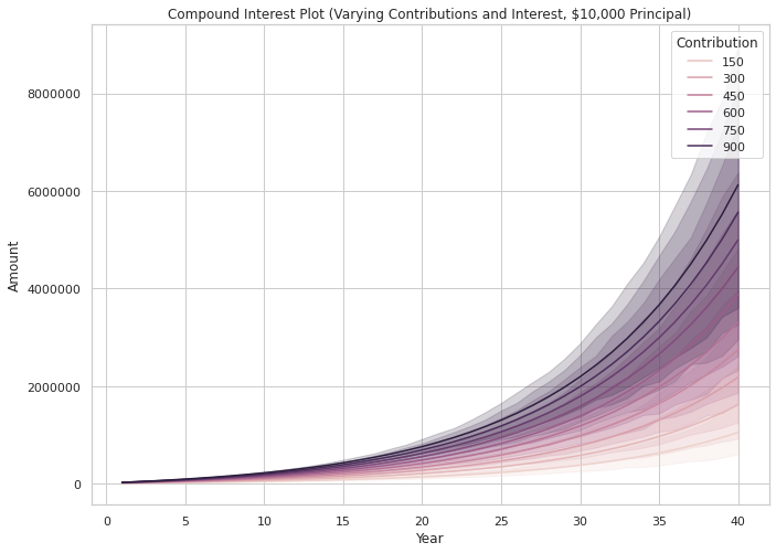
From the graph, it does appear that all the information we calculated is present. The lines represent what appear to be mean amounts for each monthly contribution. A band is created around each line showing the range of values possible with each interest rate. But, this plot is hard to read.

In the next code block, let’s see how splitting out a plot for each interest rate looks. We will use FacetGrid to plot it out with the seaborn package.

				
					# Now let's use FacetGrid from Seaborn to make our data easier to see
f = sns.FacetGrid(results, col = 'Interest', col_wrap = 2, hue = 'Contribution')
plt.ticklabel_format(style='plain', axis = 'y') # prevent sci notation on y-axis

# these next 2 lines are used to increase the size of the plot
fig = plt.gcf()
fig.set_size_inches(12,16)

# and now map a lineplot to each one of our facets
f = f.map(sns.lineplot, 'Year', 'Amount').add_legend()


Facet Grid of Varying Levels of Interest Compounded with Varying Monthly Contributions

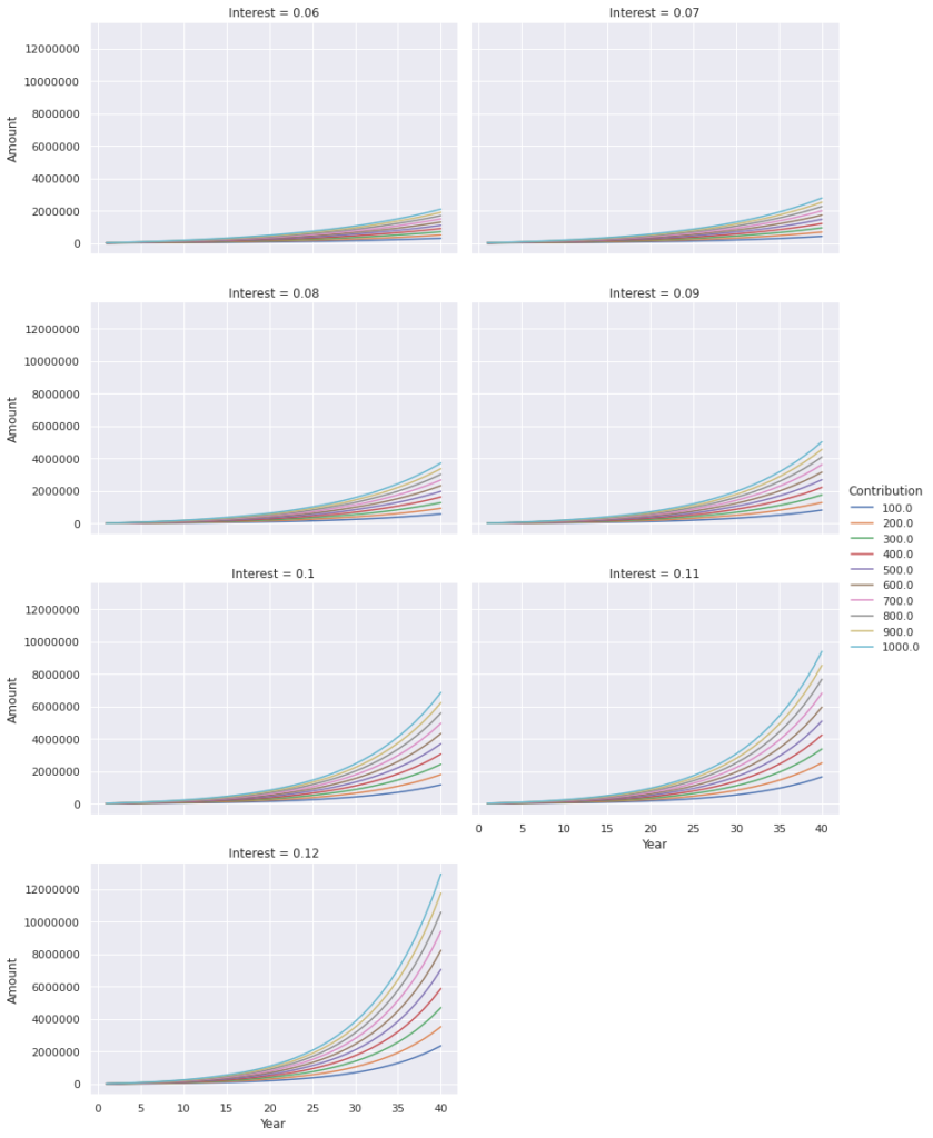
As you see above, the result splits out each interest rate and easily shows the varying monthly contributions. Using this method is excellent at giving you a ‘30,000-foot view’ of what is going on. It will allow you to make rough choices about your investment prospects and expected return.

Once you have identified a specific interest rate that matches what you expect to get in the long term based on your investments or professional advice, you can go back and look at one of the larger charts to fine tune your plans.

Quick Warning and Disclaimer

Always remember that calculating these types of things should be done with a critical eye. I’ve double checked all my code with other compounding interest calculators, but there may always be a glitch. Double check your code to make sure you’ve typed everything properly. Just because your code executes doesn’t mean that it is giving you the result that you may be interpreting.

Additionally, when it comes to trying to use this type of tool, always remember that automation cannot supersede professional advice. Always do your own research prior to making any real investment decisions.

Final Thoughts

I hope you enjoyed this quick how to guide on Compounding Interest with Monthly Contributions using Python. If this type of thing excites you like it does me then you will find other python articles as it relates to Personal Finance here.

If you have any interesting ideas or questions about the code, then feel free to drop me a line down in the comments. I created all of the content from this article using only Google CoLab and the code provided… so if something isn’t working on your end let me know and I’d be glad to help.

Guy Money

As a formally trained Data Scientist I find excitement in writing about Personal Finance and how to view it through a lens filtered by data. I am excited about helping others build financial moats while at the same time helping to make the world a more livable and friendly place.

Leave a Reply

Your email address will not be published. Required fields are marked *

Scroll to top